Improving a Benefit Experience
Airline employees have the perk of designating eligible people to use their flight benefits (such as flying standby). These people are known as an employee's "circle of travelers." The eligibility rules around who can be designated are enforced by HR employees.
Different Use Case Problems
All Employees: filled out a new web form every time they wanted to add or edit their circle of travelers, and they had to remember the eligibility rules. If changes needed to be made, employees relied on emails from HR.
HR Employees: used a very manual process to manage all circle of travelers requests that included updating spreadsheets and sending individual emails.
The Solution
Create a streamlined system with two connected web apps:
- An employee app that saves circle of travelers data, where employees can manage their circle and receive communication from HR
- An admin app just for HR employees who can view, approve, or deny circle of travelers based on eligibility rules
Testing the Employee View
Part of what made my HR stakeholder awesome was that they knew nearly everyone in the corporate office! We conducted 9 usability test interviews on an employee view concept.
Findings that Influenced Designs
- Employees need a 'save and complete later' feature because most wouldn't have the necessary relationship proof documentation (i.e. birth certificate) on hand.
- Employees need multiple ways to access educational content because not everyone noticed the educational content in the test UI.
- The design must be mobile-friendly because most employees aren’t given computers so the designs need to be responsive.
Employee View Designs
The design strategy focused on a hub and spoke concept that:
- Centered clear, user-friendly design and content to account for the variety of digital literacy among all employees
- Had contextual educational content to help maximize self-service
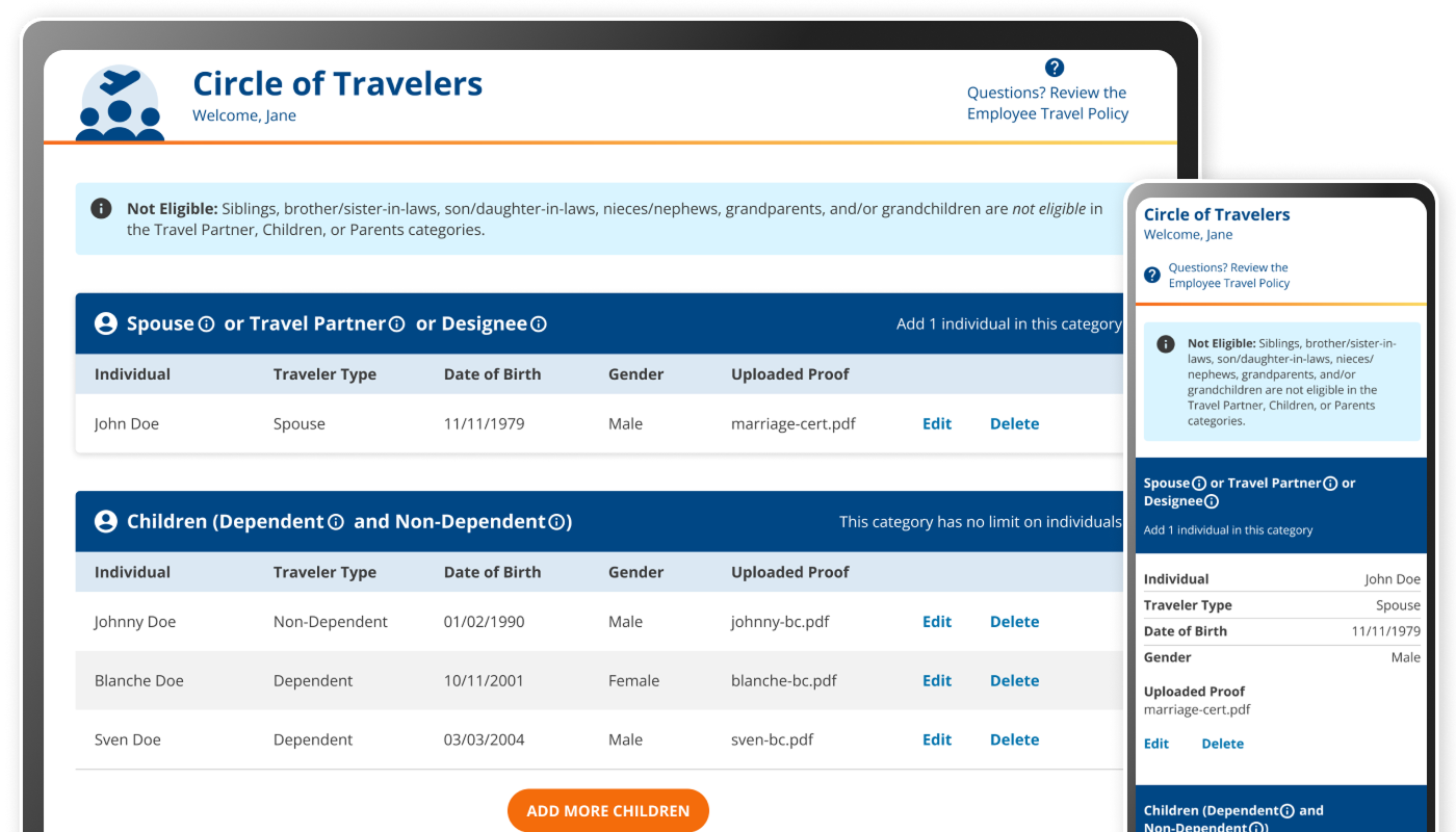
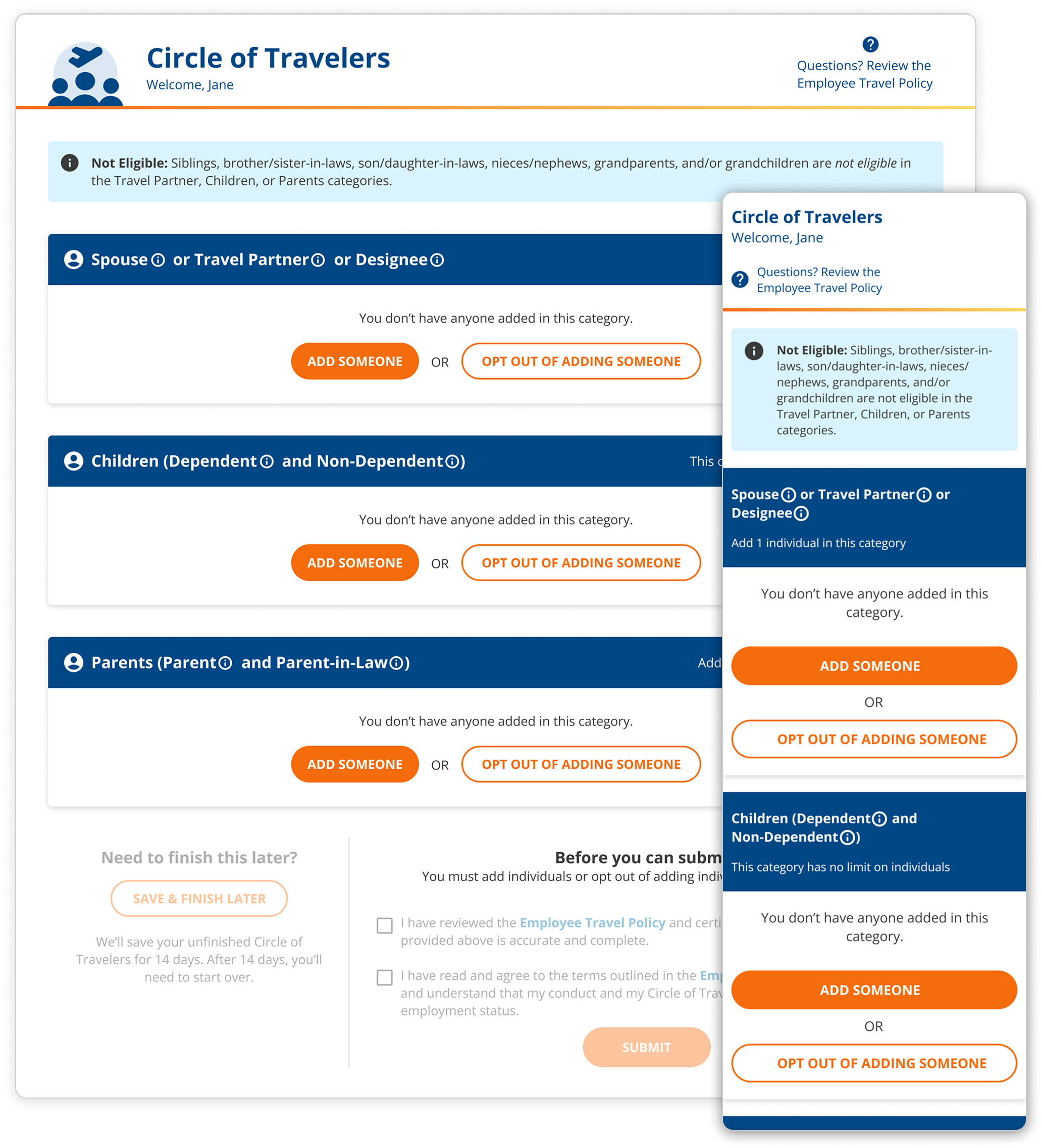
The hub page for the Circle of Travelers employee view
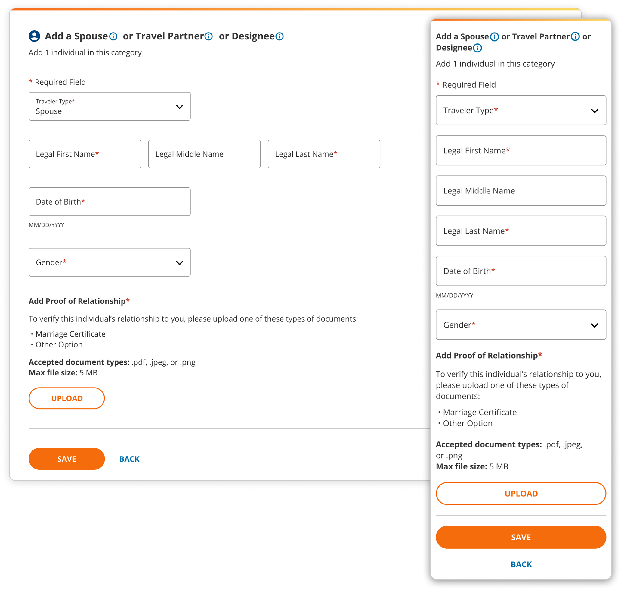
Add screen with a form for an employee to add a spouse, travel partner, or designee
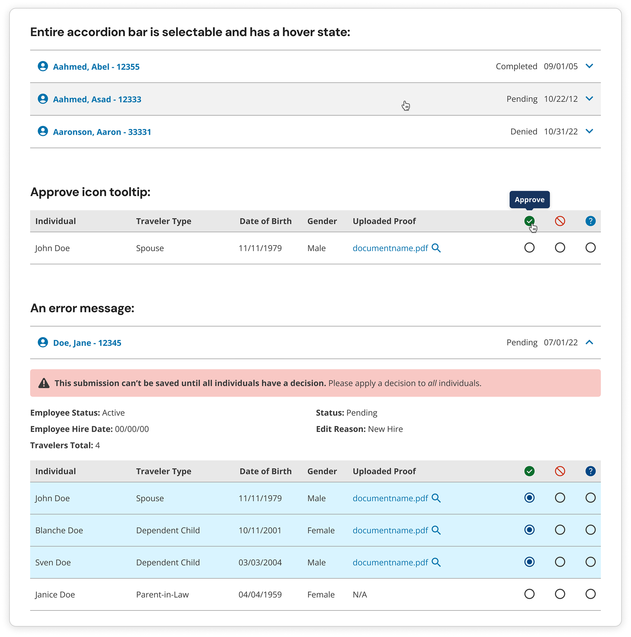
Admin View Designs
To accommodate the HR employees with managing all circles of travelers, the design focused on:
- Organizing record data by employee name and number
- An overall organized structure for easy searching and wayfinding
- Visual cues for task-based controls to process travelers quickly
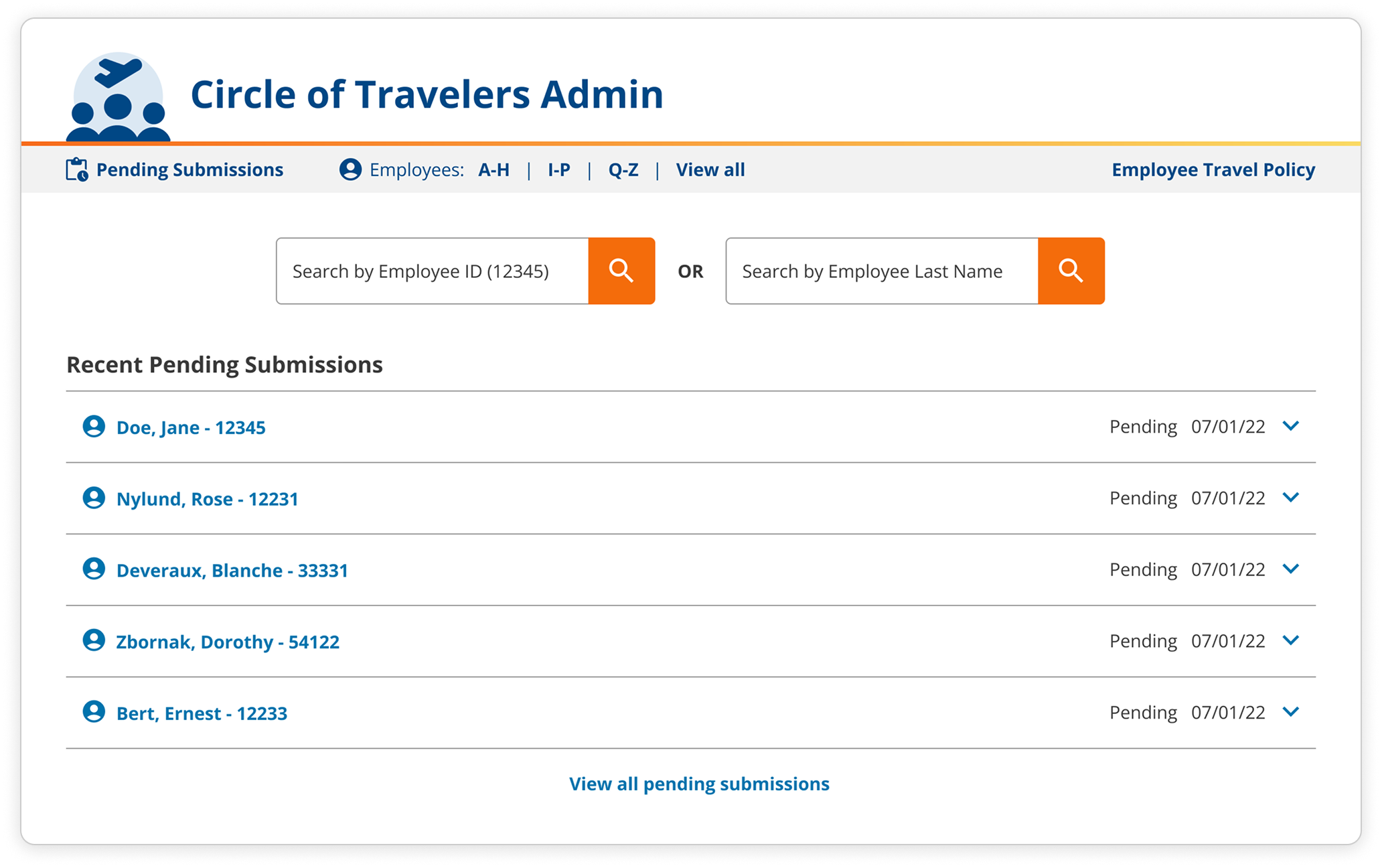
The landing page of the Circle of Travelers Admin view
A selection of UI details within the Circle of Travelers Admin view
Conclusion & Reflection
Happy Stakeholder
The HR stakeholder was pleased with the final designs, however, there were some technical challenges that affected the final product.
Product Treatment
It would be valuable to treat the Circle of Travelers experience like a product so it could be iterated and improved upon for employees.